The room color psychology of your home has become a necessary part of your daily life. In fact, the colors of your walls reflect your personality and can significantly influence your mood and behavior. Hence, choosing the right color will bring out the very best in you and your family.
Color has the power to change the shape and size of furnishings, as well as the shape and size of the room itself. Hence, it is very important to combine colors wisely when it comes to decorating.
To assist you in selecting the ideal hue for each room, we are dissecting the fundamentals of color theory. Let’s take a closer look at the different room colors associated with each room in order to create the right mood.
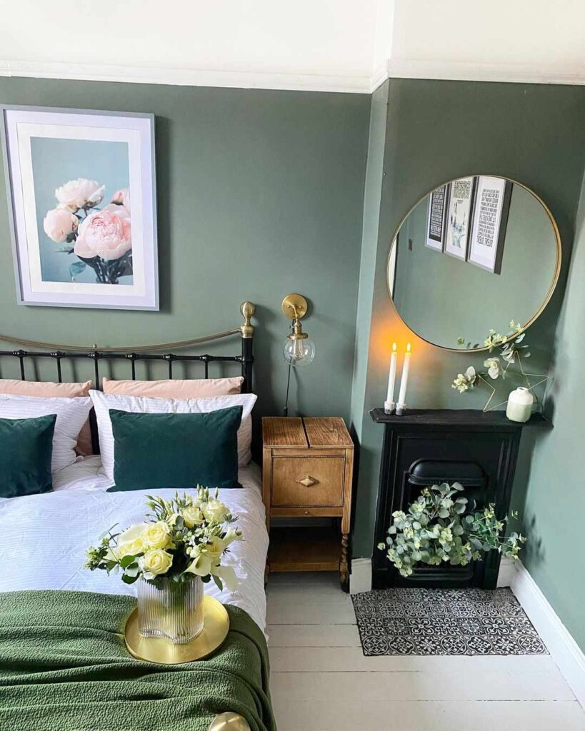
Restfulness Colors for Bedroom:
Your bedroom is a haven for calmness and relaxation, therefore the colors used and the mood created should promote these feelings. The soothing properties of colors should be taken into account while choosing a color for your bedroom.
Go for these colors:
- . Green is a fantastic color for the bedroom. It invokes a sense of calmness and serenity and helps in reducing stress. It is known for being the most soothing of all the bedroom colors, just what you need in a place that is mostly used for resting and sleeping.
- . Blue is a calming and relaxing color. It is one of our top choices for bedroom walls as it can bring down blood pressure and encourage the feeling of ease. If your room does not receive enough natural light or if you often read at night, go for pastel blues as they will keep your room looking bright. Such colors can also make any room look and feel a bit cooler, making it a great option for people living in hot weathers.
- . Bright shades of Purple ,such as lavender and lilac, have a relaxing effect on the bedroom ambience. These tones of purple make us feel comfortable, calm, and well-rested. Like greens, light purples are flexible shades that work for early and late risers as they both have soothing and revitalizing qualities.
Stay away from these colors:
- . Orange bursts with brightness and vitality, making it an ideal paint color for a playroom or exercise space. In the bedroom, however, homeowners should pick a more calming color.
- .Yellow is a lively, vibrant color that stimulates the senses. While sunny tones will provide a cheerful wake-up call for starting your day, they won’t help you unwind in the evening and will contribute to lack of sleep.
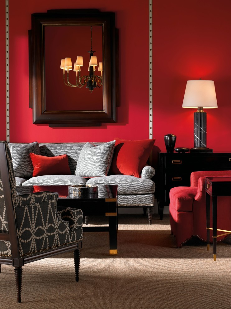
Coziness Colors in the Living Room
The living room colors should fit the general mood of ease, conversation, and fellowship. When deciding what color to paint the walls of your living room, think about cheerful and relaxing colors.
Go for these colors:
- . Red is the most stimulating color choice. It pumps the adrenaline and is great for increasing energy levels and creating excitement. Reds also promotes conversation and creativity, and can bring out your best mood.
- . Green is known as the eye’s most relaxing color because it combines blue’s reviving properties with yellow’s upbeat characteristics. It is super versatile, encompassing so many different shades. Green can make a room feel cozy, fresh, comforting, refined, or vibrant depending on the green hue that you use for your home decor.
Stay away from these colors:
- . Violet can make a space seem closed in. It is made up of two contrasting hues – blue and red – and if used liberally, can create an interior that may seem garish. Consider adding this color in small accents like throws, pillows, a patch on the wall, artworks, or vases. Since it is a deep, lush color, it has a large impact even in small doses.
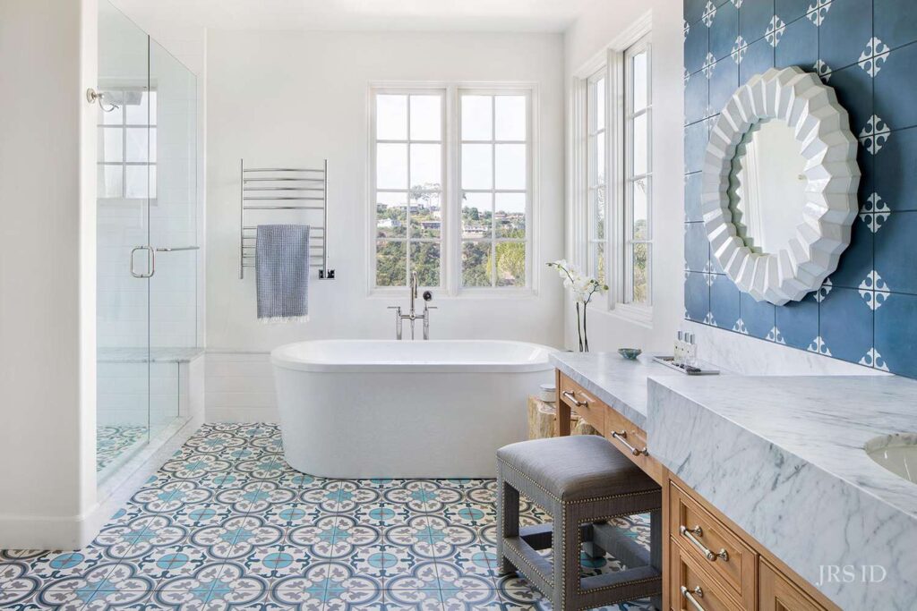
Calming Colors for Bathroom
A trip to the spa leaves you feeling relaxed, pampered, and rejuvenated. The serene environment is carefully designed to help you unwind and escape, and you can easily re-create that soothing atmosphere in your own bathroom. Hence, color psychology in bathrooms should emphasize soothing, calming, and bright colors.
Go for these colors:
- . Yellow is a vibrant uplighting color that gives life to your bathroom. It adds a bit of cheerfulness to a bath, whether it is a pastel shade for a more casual look or a golden tone for a sophisticated style.
- . Blue represents the deep blue sea and brings back memories from a much-loved holiday. It also reminds you of the color of the sky that you can see from your bathroom window. It is evocative and relaxing, and plays well with many other colors. This nature-inspired color adds relaxing vibes and can transform your space to a spa-worthy experience.
Stay away from these colors:
- . Red in bolder tones may be a little too harsh for the bath. It is one of the most controversial choices you can make when it comes to interiors, and the bathroom is no exception. Bolder tones can be too harsh for the bathroom, so you should avoid the shade if you’re looking for a more relaxing space.
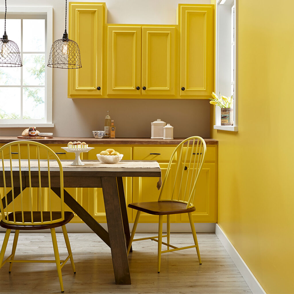
Happiness Colors in the Kitchen
The kitchen is a social setting where ideas are generated. Hence, you should choose paint colors that encourage creativity and enjoyment. Your room’s color psychology can be improved by using cheerful wall color which will quickly lift your spirits.
Go for these colors:
- Yellow adds a lively vibe to your kitchen. If your kitchen doesn’t get much natural light or could use some visual warmth, yellow is the perfect choice. Use it to brighten up the space where you and your family gather, and fuel yourselves with a burst of sunshine
- Green promotes coziness in your kitchen. It is a color we associate most with nature, and if used correctly, can be an ideal shade to breathe life into a kitchen design.
Stay away from these colors:
- Black is too dramatic for a setting that values casual dialogue. It is a harsh color that absorbs light rather than reflect it, which can dim the room. Moreover, dark colors tend to make the room look smaller.
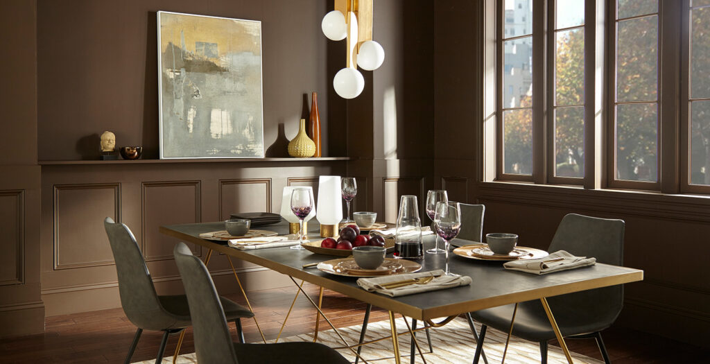
Elegance Colors for Dining Room
According to room color psychology, you should choose colors that stimulate appetite while choosing the best mood of positivity for your dining room. In fact, certain hues have been shown to decrease appetite, which is something you want to avoid in your dining area.
Go for these colors:
- Red is a very energizing and powerful color that will make your guests feel warm and invigorated. Reds and burgundies are connected to the fire element, which is inspiring, warm, and activating. Red has been said to stimulate appetite, and is often seen in traditional dining rooms.
- Brown has a warm, earthy energy, and it is a great color choice if you want to help your guests feel settled. Brown is connected to the earth element, and earth energy is stable and steady.
Stay away from these colors:
Blue and Green are thought to be appetite-suppressing hues. Don’t use these colors unless the whole family is on diet!